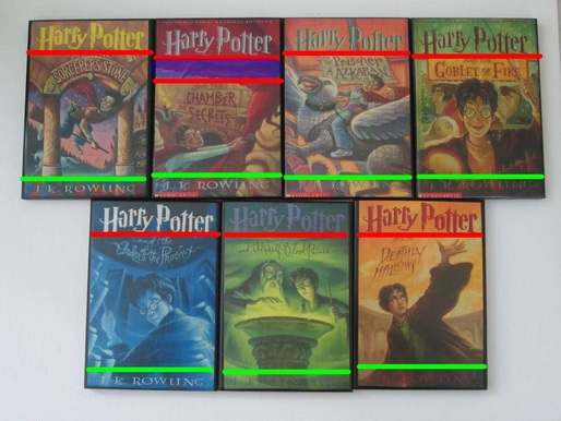
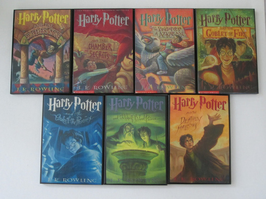
Arrangement (US Covers)
Every Harry Potter book features the logo centered at the top of every cover with the title of the book usually directly below it, except for the Chamber of Secrets cover, in which the phoenix's head goes in between "Harry Potter" and "the Chamber of Secrets." The covers all have characters and items from the story and the illustration continues onto the back cover. The author’s name appears on the bottom of the front cover. Each chapter also includes an illustration above the chapter title.
Emphasis (US Covers)
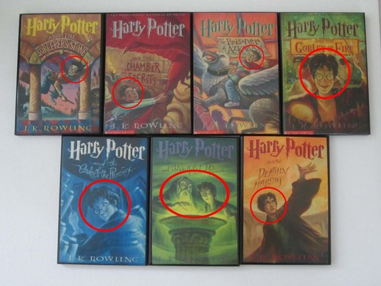
The emphasis of each cover is obviously the Harry Potter logo in a metallic color, with slightly less emphasis on the book title underneath. An image of Harry appears on the cover of every book and is usually the emphasis of the illustration, with the exception of the Half-Blood Prince cover, in which Albus Dumbledore shares the spotlight.
Clarity (US Covers)
With the logo on every cover, readers will recognize that the book is part of the Harry Potter series. The title of the book appears in different fonts and is somewhat inconsistent, but it shows viewers that each book is a different story revolving around the same theme and characters. The illustration style also aids viewers in recognizing each book is part of a series, as well as the consistent location of the author’s name in the same font.
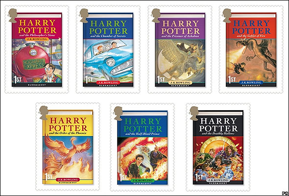
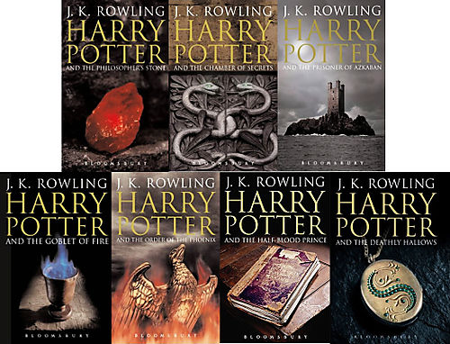
Clarity (UK Children's Covers)
Since the UK children's versions of the Harry Potter books were illustrated by four different artists, the cover art on its own might not convey that the books are part of the same series. However, they all feature a very consistent placement and formatting of each book's title. The entire book title appears in the same font with a block of color behind it to distinguish the title from each book's illustration. J.K. Rowling's name is placed at the bottom of every cover within the same shape, with the exception of the Philosopher's Stone, in which the author's name appears just below the title. Viewers would easily be able to recognize these books as part of the Harry Potter series despite the inconsistent illustration style.
Conciseness (US Covers)
The cover art alludes to parts of each story but does not necessarily give away the plot of the book. The artist was sure to customize each cover so that it incorporates important aspects of each story and changed the color scheme depending on the book.
Tone (US Covers)
Since the artist read through drafts of each book before creating different cover art options, she conveys the feelings and main messages she gathered from the stories through illustration. The artist uses color and title font changes to show the theme and seriousness of each book. As the emotional complexity of the characters in each book advances, the readers growing up with these books were most likely going through the same intellectual changes, so the increasingly dark, mysterious, and simplified cover illustrations demonstrate parallels between the audience and the stories. The binding style with the diamond pattern gives off a somewhat academic feel.
Tone (UK Adult Covers, 2nd Edition)
The tone of the adult covers released in the UK is significantly more serious than the children's editions. The use of altered photographs or very realistic illustrations leads the audience to believe that these stories aren't just aimed at children. The adult covers don't utilize a wide variety of covers and at least some of the cover is black or gray, allowing the covers to suggest that the books contain dark and mysterious subject matter.
Ethos (US Covers)
The book covers are cartoonish and friendly enough to attract a juvenile audience, but include enough mystery to intrigue adult readers. The consistency in cover illustration style and the presence of the logo let the audience know that the book is part of the same series and will be of the same caliber.
